We all want a clean and professional look for the BCIT website. Consistent sizing, placement, and use of images is one factor in achieving this.
Choosing images
Used thoughtfully, images can be a powerful tool in bringing your web page to life. Here are some basic guidelines for choosing impactful images:
Do: reinforce purpose
Images can add interest and illustrate purpose. Choose images that help the user understand the purpose of your page, and reinforce the messages on it.
Do: reflect our brand characteristics
BCIT delivers an education that goes beyond textbooks and classrooms. Wherever appropriate, reflect technical skills, interaction with technology, real-world or hands-on experience, or problem solving in your image choice. Most images should include people, ideally in inspirational work or learning spaces.
Do: showcase BCIT
Where possible, showcase BCIT people and places. Choose images that portray our students, faculty, or staff learning and working on our campuses and in our classrooms, or in real-world work situations. Avoid generic stock photos.
Do: reflect our diversity
In images that include people, reflect the diversity of our student and employee population by aiming for a mix of ethnicities, abilities, age, size, and gender expression, as well as people with diverse religious or cultural attire.
Do: consider mobile users
Up to 50% of visitors to bcit.ca view our site on a mobile device. WordPress is responsive, meaning it will automatically resize and reformat images so that the best size and weight is shown for the screen each website visitor is using. Images with a narrow focus (e.g., close-ups) can be more difficult to crop successfully, especially if they contain people. In Preview, make sure your image works on various devices by resizing your browser window.
Do: be selective
Don’t go overboard with images – text loads quickly, but images add to load time (and videos even more so!). In general, people want to find information quickly and may not wait for graphics to load. People on limited data plans (often, students) also won’t want to waste precious data loading unnecessary images.
Do: be accessible
To meet web accessibility standards, an image must have a text alternative that clearly and meaningfully describes what it contains. This means using alt text to add a visual description of what the image contains. Learn more about adding alt text.
Don’t: use images with text
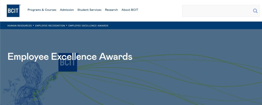
Don’t use image files as a way of formatting and highlighting text (i.e., all text visible on a page should be entered as text, not an image of text). This is a poor practice that violates accessibility standards. (Instead, learn how to emphasis content the right way.) Don’t use images with text in header banners as in the example below; the title overlay conflicts with any background text, making for poor legibility.

Formatting images
When you upload an image, WordPress does most of the heavy lifting and will optimize and resize your images so that the best size and weight is shown for the screen each website visitor is using. It’s still a good idea to start with an appropriate size (weight and dimensions) so that our database doesn’t get too big over time. Cropping an image you intend to use as a hero image also allows for more control over the image focus.
You shouldn’t ever need an image larger than 2000 px wide. (This is a good default size and will cover all image-placement options, including the hero banner.) In contrast, never stretch a small photo to fill a larger space. This often introduces blur.
Photo editing tools such as Adobe Photoshop (requires a paid subscription) make cropping and resizing easy. For more information on paid and free Adobe software available to Faculty & Staff, please refer to Using Adobe Software for Faculty & Staff. You can also use free online tools such as Pixlr.
Designing with images
- Find specific guidance on choosing and working with header (hero) images in the Style Guide.
- View various image treatment examples in the Style Guide.
More information about public website WordPress
-
Adding, Removing, and Editing Links in Public Website WordPress
-
Cancelling Events in the Public Website WordPress Events Calendar
-
Creating and Editing Events in the Public Website WordPress Events Calendar
-
Creating and Managing Course Umbrellas in Public Web WordPress
-
Creating and Modifying Site/Navigation Menu Structure in Public Website WordPress
-
Creating Headings, Lists, Tables, and Other Core Content Elements in WordPress
-
Embedding Background Video in Page Headers in Public Web WordPress
-
Embedding Video and Video Playlists in Public Website WordPress
-
Fixing and Preventing Broken Links on your Website using Checkbot
-
Managing Mailing Lists and Subscribers in Public Website WordPress
-
Managing PDFs and Other Documents for the BCIT Public Website
-
Navigating Between Multiple Section Views in Public Website WordPress
-
Previewing Your Responsive WordPress Content As It Would Appear on Other Devices
-
Reviewing, Comparing, and Rolling Back to Previous Versions of Content in Public Web WordPress
-
Updating the Global Alert in Public Website WordPress (Emergency Response Team Only)
-
Usage Guidelines for the Events Calendar in Public Website WordPress