The BCIT website is “responsive”, which means that the content is formatted appropriately for each device used to view it. While this generally works very well (very very rarely is anything “broken” when viewed on a smaller device), it’s still useful to look at your page in different views before you submit it to your Publisher, even if you’ve only made a small change to a previously published page.
Things to consider:
- If a user comes to your page using their phone, is the most important information on the page available to them within a couple of scrolls? Or would they have to scroll for a while/to near the bottom of the page to find it?
- If your page is using a hero image, does the hero image work when resized for a mobile phone or tablet? Some images that look great on a desktop computer aren’t so hot on a smaller screen (important details lost, etc.).
- If you have an image at the top of your content (right-aligned with the content flowing around it on a desktop computer, centered with the text below it on a mobile device), is that image relevant and engaging enough that a user on a mobile device would likely continue to scroll? If not, it may make sense to move the image further down the content and prioritize the textual content.
- If you’ve used a table and table is necessarily larger than the space allows, users on a mobile device can scroll left and right to see it (this is expected and intentional behaviour). Does the table still “work” in this context? When looked at in this context, does every column still feel necessary?
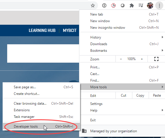
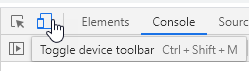
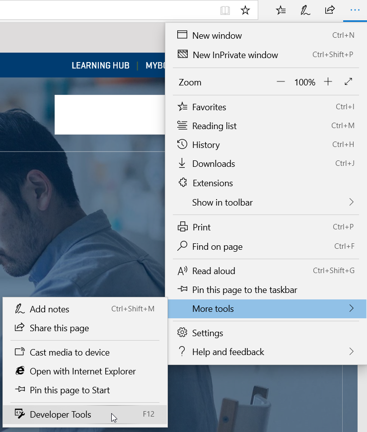
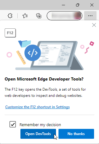
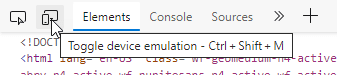
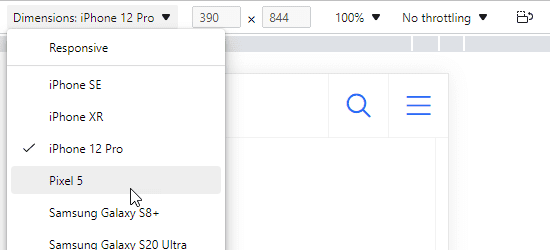
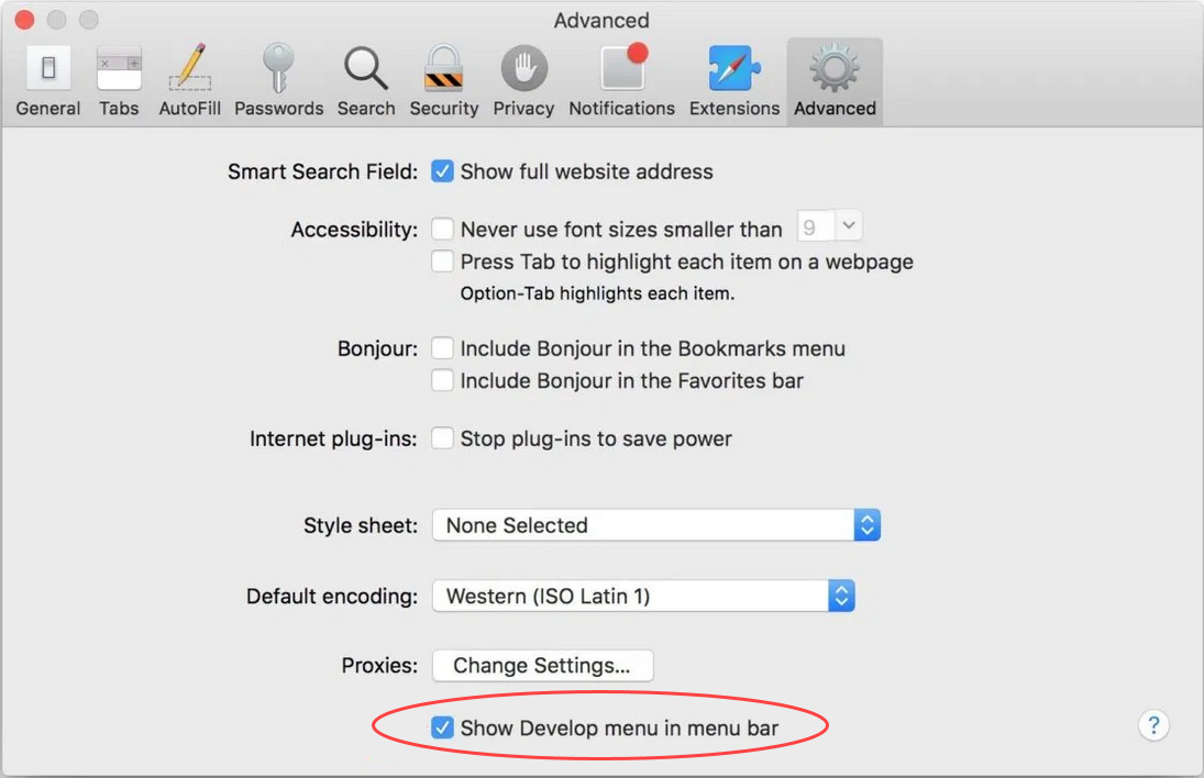
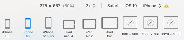
Every browser has some form of responsive previewing tool built into it. Follow the appropriate instructions below to access them.
Tips
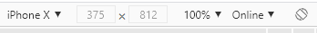
When using any of the browser tools above:
- Scroll down your page with the built-in scroll bar. You can also use your mouse track wheel when your mouse arrow is positioned over your page content.
- To see a rotated version of a device layout, click once on the change orientation icon. Click again to restore the original orientation.
- You can also drag the handles to the right, bottom, and at the bottom-right corner to resize the view. When you do so, the header bar will display the current size.
- You can click on links to go to another page, and navigate around the site.
More information about managing public website WordPress content
-
Adding, Removing, and Editing Links in Public Website WordPress
-
Cancelling Events in the Public Website WordPress Events Calendar
-
Creating and Editing Events in the Public Website WordPress Events Calendar
-
Creating and Managing Course Umbrellas in Public Web WordPress
-
Creating and Modifying Site/Navigation Menu Structure in Public Website WordPress
-
Creating Headings, Lists, Tables, and Other Core Content Elements in WordPress
-
Embedding Background Video in Page Headers in Public Web WordPress
-
Embedding Video and Video Playlists in Public Website WordPress
-
Fixing and Preventing Broken Links on Your Website Using New Checkbot
-
Managing Mailing Lists and Subscribers in Public Website WordPress
-
Managing PDFs and Other Documents for the BCIT Public Website
-
Navigating Between Multiple Section Views in Public Website WordPress
-
Previewing Your Responsive WordPress Content As It Would Appear on Other Devices
-
Reviewing, Comparing, and Rolling Back to Previous Versions of Content in Public Web WordPress
-
Sharing a Temporary Preview of a Public Website WordPress Page
-
Updating the Global Alert in Public Website WordPress (Emergency Response Team Only)
-
Usage Guidelines for the Events Calendar in Public Website WordPress