UI & prototyping

Design activities take the outputs of research and turns them into solution ideas. Once you understand your customers and your problem(s), you move on to developing and prioritizing testable ideas.
Digital design is comprised of many different practices across several fields – information architecture, interaction design, visual and graphic design, copywriting, psychology, and more recently motion design and AI, just to name a few. For our purposes we’ll be focusing on the core aspects of design pertaining to the work we do on web sites and applications at BCIT.
Much like an architect designs the structure of a building, an information architect does the same thing for the content/functionality of a digital product like a web site or application. Feet and inches become pixels and ems. Floorplans become user and application flows, and layout renderings become wireframes and sitemaps.
“Facilitate understanding, organize meaning, create clarity and establish truth.”
IA focuses on organizing, structuring, and labeling content in an effective and sustainable way. The goal is to help users find information and complete tasks. In a nutshell, the content structure and user flow of a digital product is its information architecture.
Many methods can be employed to design the structure and flow of a digital product. Below are some of the most common approaches we use to design IA at BCIT and we’ll be happy to help you with any or all of them.
Sitemaps
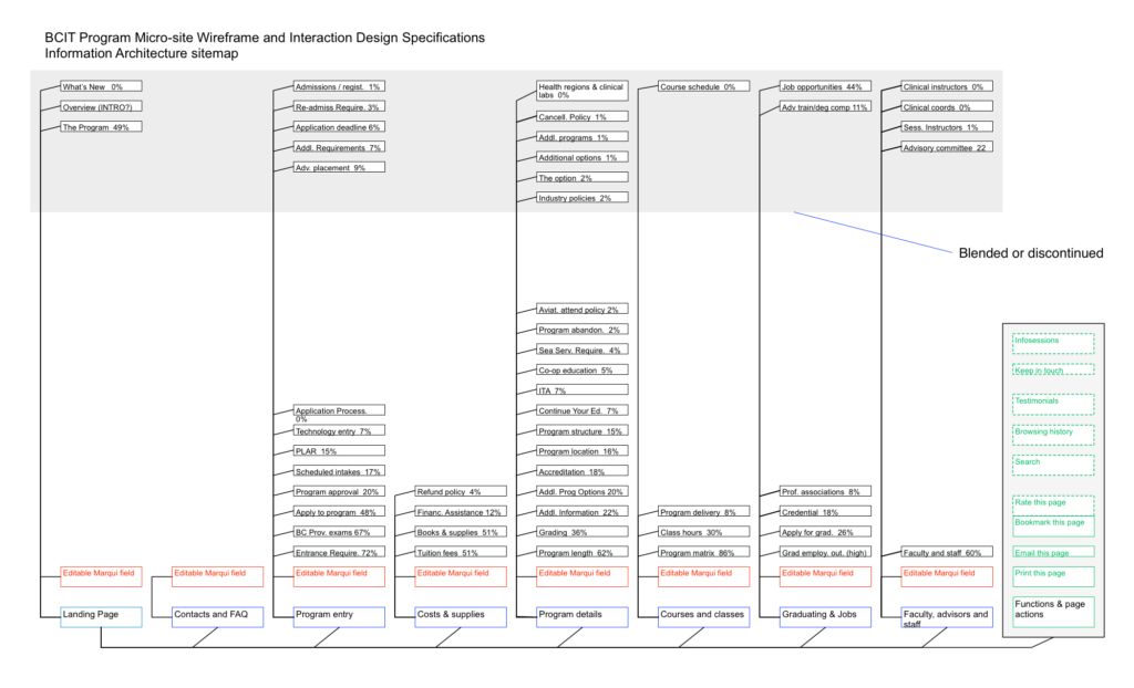
There are really two different types of sitemaps. The traditional sitemap is a visual, hierarchical representation of the structure of a website and there’s also an XML sitemap, which is a file you place on your site to help search engines index your content. For the purposes of UX design, we’ll be focusing on the former. At their cores, they are the same concept, though.

For a small five or six page brochure website, a sitemap isn’t needed, but it’s an invaluable part of early design work for planning out a large, information-dense web site. Sitemaps help you organize and categorize content, visualize interconnected pieces of content, plan navigation, balance structure and build shared understanding with your project team.
User flows
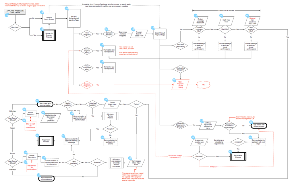
A user flow is a diagram that shows at a glance, the path your user will take through an application or the sequence of actions required to achieve a certain goal. Where a sitemap shows hierarchical content structure for a site, a user flow shows possible paths through an application, and is a crucial step in planning functionality and navigation, decision points and branching paths, and acts as an inventory tool for planning steps, hints and messaging to assist users in their journey.

User flows can take many forms, from simple flowchart shapes with directional connectors, decision points and branches, all the way up to screen representations, as part of a click-through prototype. A very effective approach can be to include the user flow with screens/wireframes (more below) in a more complete UX reference document for other designers and developers.
Wire flows
While we’ll be talking more about wireframes and prototypes in the next section, it’s worth just mentioning blended flows at this point. One of the most effective flow documents is one that combines a simple high-level user flow, with the actual screens you want to build, with click-throughs to larger screens. It’s a very effective way of building understanding for developers and is also a very testable artifact for users.
Navigation Design
Whether you’re designing a website or an application, sitemaps and user flows are very useful tools to help you plan the navigation for the users. They help you visualize which content or steps need to be in the primary navigation, which pieces will be contextual to certain areas and which will be secondary to be relegated to places like the footer. For a website, the sitemap will provide direction for the navigation menus you design, whereas a user flow will give you starting points for the path(s) your users will take through the application. Navigation is more embedded directly in an application than a web site, through the interactions designed into the application.
Tree testing for navigation testing & revision
About wireframes
As a general rule, wireframes can be considered part of information architecture as a structural planning tool, but they also cross over heavily into UI design and, as such, we have included them in the next section about UI design and prototyping in the accordion below.
Continuing with the building analogy, the elements of a building which a user interacts with (interfaces) include door handles, elevators buttons, washroom fixtures, wall switches and anything that allows them to go somewhere or complete a task. On a web site or application, a user clicks links and buttons, accesses navigation menus, fills in forms, conducts searches and does many other things that allow them to go somewhere or complete a task. A prototype is simply a testable representation of a website or application, and can be of varying fidelities, based on what we are trying to learn.
“Design is not just what something looks like and how it feels. Design is how it works.”
This section is a very quick overview of the general approach to UI design we’ll take at BCIT. It is not a complete guide.
Wireframes

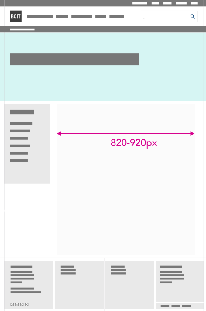
Wireframes are most often monochromatic blueprints that specify the layout of a UI. While wireframes can be thought of as part of the IA, unlike sitemaps or flows they are very specific to the user interface, so they are included here as the first stage in UI design. The easiest way to think of a wireframe is as a skeleton, ready to be brought to life.
Wireframes are easy to create with everything from felt pen and paper, to erasable felt and whiteboards, to many digital diagramming and design tools. They are most often low fidelity since they are early stage and change frequently, but as you move through the design process, they can easily be more complete UI designs, which factor in colours, fonts and some elements of interaction design.
A good overview of wireframing.
Interaction Design (IxD)

Where IA is site or application structure and wireframes are the blueprint for the UI, interaction (and visual/graphic) design can be thought of as designing the elements that allow people to interact with an application or website. When it comes to digital products there really isn’t a tidy dividing line between graphic design and interaction design, because the fonts, colours, buttons, system messaging and more are byproducts of both.
Some of the questions we grapple with during this phase are:
- How do menus behave when people click them?
- Should we use accordions for content?
- What colour should our buttons be?
- How big should things be in relation to each other?
- What are my key calls-to-action and how much white space should I use?
- How will gestures work on touch screens to accomplish tasks?
- How does the system provide feedback to the user when tasks are completed?
In essence, we can think of interaction design as the process of bringing a wireframe to life.
Prototyping
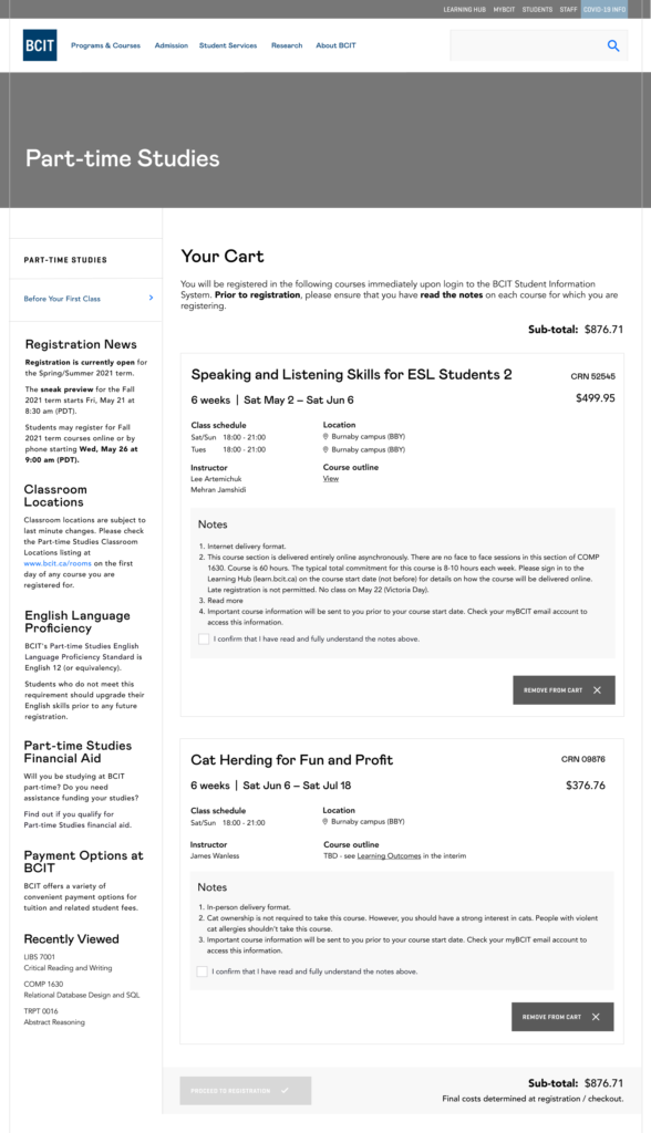
A prototype is a testable representation of the user interface of an application or website. It can be of a range of fidelities (from paper all the way up to functional digital) but it needs to be something you can observe people use and complete tasks with. The reason we like to prototype and test new designs first is because it’s much cheaper and faster to fix problems than testing a partly or fully coded/finished product on users. For example, the example in the section above is actually one of the screens of a functional cart prototype for bcit.ca.
Prototypes vs Wireframes
While paper prototypes can be a very cheap approach to testing a simple concept in-person with a user, setting up and conducting remote user testing is much faster, so we tend to prototype with cloud tools like Figma and video test with Teams. Also, a reasonable digital prototype is far more realistic than a clunky paper one and we find results to be more useful. In truth, though, depending on what we’re trying to learn, sometimes we want to test task completion with a realistic prototype and sometimes we want to get simple ratings or A/B results from a screen design without functionality.
More information on many aspects of high to low fidelity prototypes.